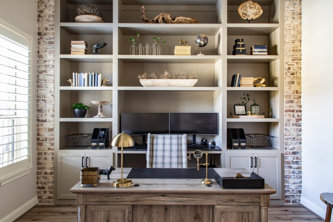
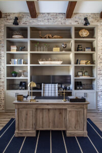
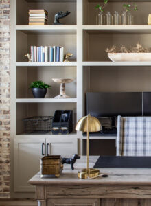
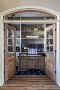
I’m SO excited to finally be able to share our home office renovation project with you all! Now this project wrapped up late last summer, so there’s been quite the time gap in revealing the final result. In our defense, once school was back in the swing of things and the holidays rolled around, life got hectic and busy (as it always does during that Thanksgiving-Christmas timeframe). But the wait is finally over and I’m so happy to finally share this space with you.
This post contains affiliate links. I will make a small commission if you make a purchase through one of these links, at no extra cost to you. Shopping through my links helps to support my blog and content, and is truly appreciated!
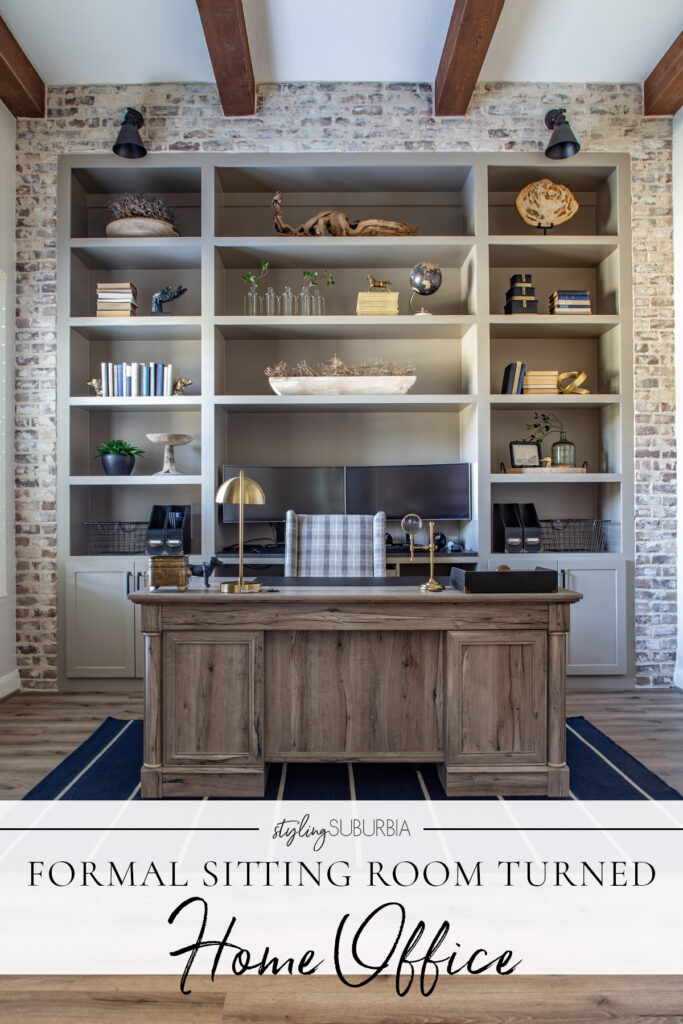
I’m going to link and source everything I can for y’all, from furniture to paint colors. I will provide a direct link wherever possible and if not I will direct you to where it was purchased from. Some of the decor items and hardware were antiques, so I can’t link those. All details will be at the end of the post!
* Now if you need a quick refresher on this project, head over to my Instagram page and watch the office highlight. I chronicled the entire renovation project there from start to finish in detail.
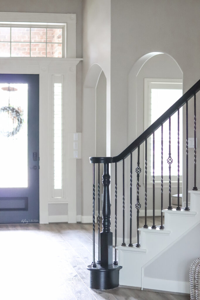
Let’s chat about the space and where we started. Just off the entry as you enter our home there was a formal sitting room. When we first looked at this house when it was on the market, we knew this kind of space would be useless for us. This house was built in 2009, so the home office trend was not a feature most homebuilders offered yet. The space had two arched entries into it and was completely open to the entryway and dining room across the way. It was not a space we could even temporarily use as an office because of the openness and noise level. So when we moved in, we temporarily stuck my husband’s home office in a spare bedroom and figured we’d renovate the sitting room one day.
Well fast forward to 2020 and all that went with it. With my husband now forced to work from home long term and with both kids home and out of school, the temporary spare bedroom office (which was just down the hall from our playroom) was no longer functional or feasible. We knew that the time had come to turn the sitting room into an actual home office.
We knew right off the bat that this was not a project we wanted to DIY and tackle ourselves. If we were to list our house, the difference between having a sitting room vs. a home office on an MLS could very well affect our home value, especially with the entire country now forced to work from home. Because of that, we wanted the space to be professionally done, and we just didn’t have the necessary skills or time to make that happen ourselves.
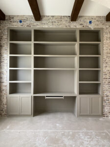
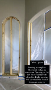
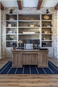
As far as design goes, I had a very specific vision in mind and really wanted an old world library feel. Since the space was right off the entry and one of the first things you see as you walk in, I wanted it to definitely have a wow factor. The space already had existing beams and a very tall ceiling, but other than that it was a complete blank slate. I knew I wanted floor to ceiling built ins along the back wall encased in bricks. And I knew the arched entries were going to need to be framed in and that we’d need some doors installed. So as far as trades go, we were looking at carpenters, masons, framers, painters and electricians. That’s a lot of different people to hire, and it was a little overwhelming. Because there were so many moving parts, we decided to explore using an interior design firm to help us manage the process.
Now I had already been following Moore House Interiors on Instagram and I knew that style wise it would be a good fit, so we reached out in May of 2020. The first step was to schedule a free discovery call with Ashley, the lead designer and CEO of Moore House Interiors. This is where we discussed the scope of the project, budget, timeline and overall just to get a feel if it would be a good fit on both ends. We also learned about their design process and what all that would entail. We decided to move forward, so the next step was scheduling a scope of work consultation. This happened in early June, and Ashley and her team as well as the builder, Wamhoff Design|Build were present. We all took a look at the space and talked about budget, expectations and the timeline.

After that came the formal proposal and contract signing at the MHI office in Tomball. This is where we got to see all the pricing, including the cost of the build and materials as well as MHI’s design fees. We signed two separate contracts with both MHI and Wamhoff. This was another reason why we chose to use a designer – we wanted a contract in place for liability reasons. I’ve heard one too many bad stories about homeowner’s getting screwed over by bad contractors and having no legal recourse because there wasn’t a formal contract in place.
Next up in the process was the design presentation. This was the fun part where we got to pick all of the finishes from furniture and fixtures to paint and bricks. We had previously filled out a questionnaire and sent over our inspiration photos for the space, so everything was based off of that. Once all of these details were finalized and orders for materials had been placed, we had our pre-construction meeting with Wamhoff at our house where we went over all the details again. Construction began in mid August 2020.
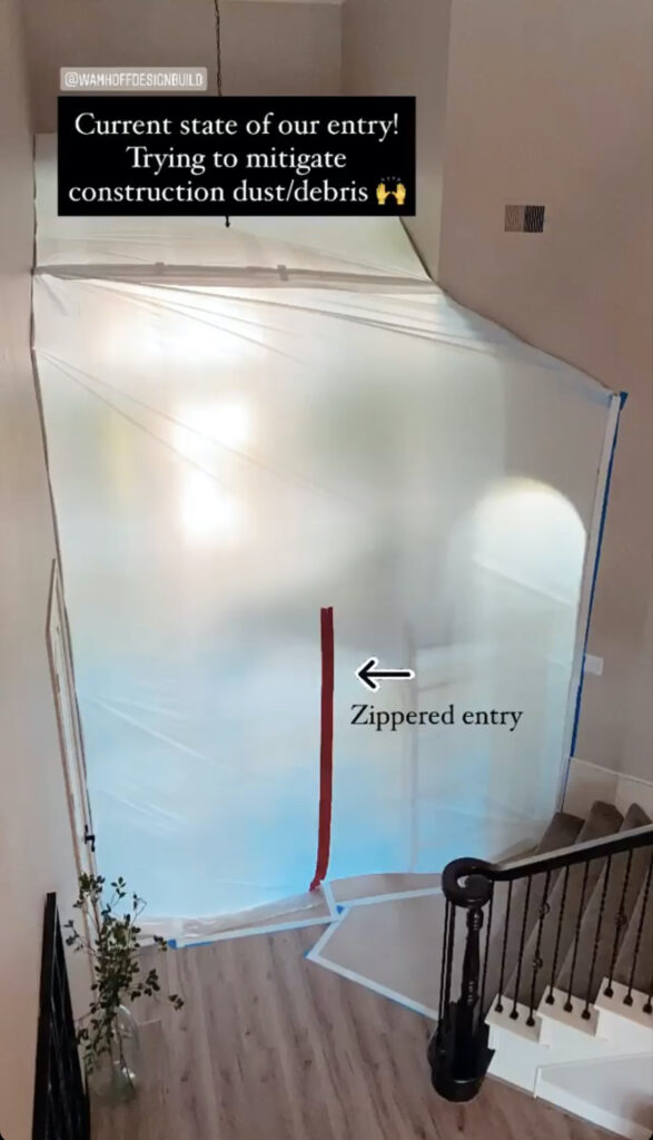
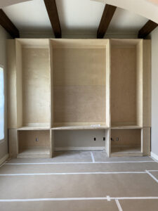
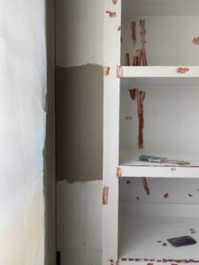
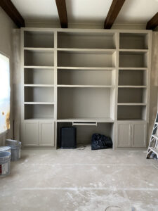
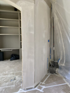
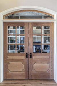
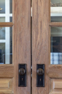
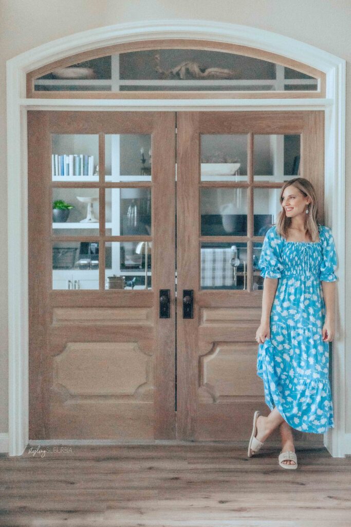
The project was completed the first week of October. Normally it would have been done a lot faster, but because Covid had affected supply chain and lead times for so many things, the process was a lot slower. As far as the build process, it began with the carpenter constructing the built ins and then those were prepped and painted. Next was all the masonry work, electrical, and then the framing and sheetrock. Last was the installation of our custom white oak french doors, transom window and finally, wall paint. Below are some photos from throughout the construction process. Again, see my office Instagram highlight for more details!
Overall the process working with Moore House Interiors and Wamhoff Design|Build was amazing! They both made the entire process so painless and easy. If you’re at all thinking about hiring an interior designer for a project, I 100% think that it’s a service worth saving for and utilizing if at all possible. Especially on large scale renovation projects like this one. Having someone handle all the ordering and logistics as well as the contractors and building process was so nice. And we also got to utilize their direct-to-trade pricing, which means we did not have to pay MSRP for things like furniture, hardware and fixtures.
Images Courtesy of Grace Laird Photography
Now let’s get to the fun stuff – all the pretty details! I’ve rounded up everything I can for y’all. Let’s start with the building details:
- Builder: Wamhoff Design|Build
- Design: Moore House Interiors
- Styling: Styling Suburbia (me!)
- Wall Paint Color: SW Accessible Beige
- Cabinetry Paint Color: SW Taupe Tone
- Bricks: Old Texas Brick – Old Hard Tan
- Floors: Republic Flooring, The Westwood Collection, RETW3304 Beverly Glen
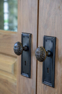
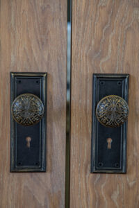
- Antique Door Hardware: Eastlake Hardware
- Vintage Books Curated by: @sorrythankyou79
- French Doors Finish: Rubio Monocoat Oil Plus 2C, Cornsilk
- Custom Upholstered Desk Chair: Bassett Stockton Desk Chair
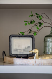
Next up are all the shelf styling pieces I can link to directly. I’m also including some dupes and similar items.
We are so incredibly happy with how the space turned out. We’ve lived with it and used it for five months now, and it is absolutely perfect for us. Read more about my experience with Moore House Interiors on their blog here. If you have any questions that I didn’t address here, feel free to reach out! Be sure to follow along on Instagram to see what our next renovation project will be!

